Policy Basics
Designing Accessible Within Brand Constraints
Mission
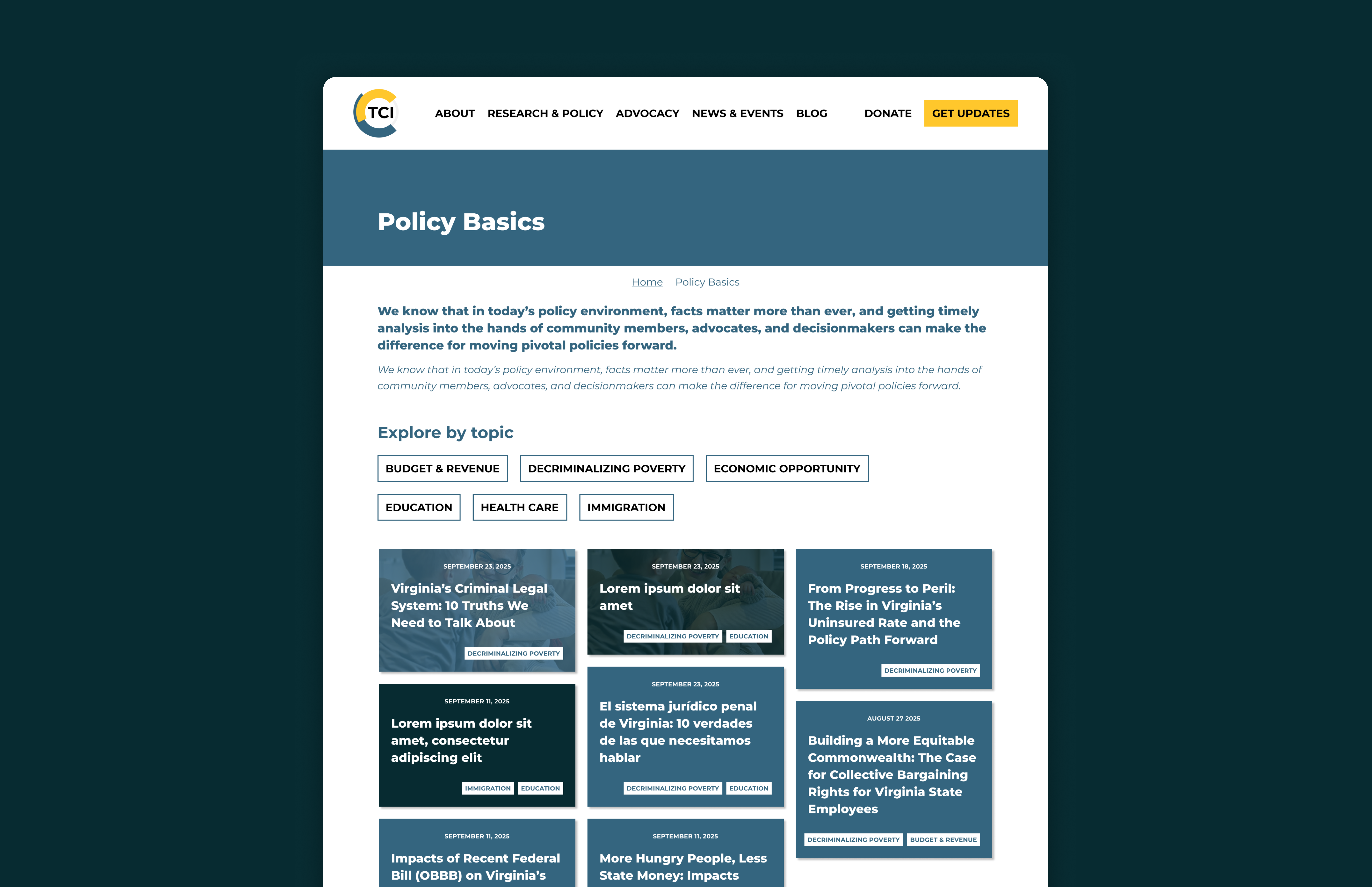

The Commonwealth Institute for Fiscal Analysis (TCI) advances racial and economic justice in Virginia through credible, accessible fiscal and policy research. Their work shapes legislation and public conversation, but only if people can actually find and understand it. Policy Basics was designed to make that research more reachable: a new section of the site that organizes TCI's issue areas in a way that's clear, filterable, and built for people who aren't policy experts.
My Contribution
I designed Policy Basics from scratch within TCI's existing brand, working with their established color palette and typography without introducing anything new. Within those constraints, I made targeted accessibility improvements to two components: the card hierarchy and the site navigation. Both were already in use. Neither was working as well as it could. The goal was to fix what was actually broken without touching what wasn't, and to make the site more accessible without disrupting the brand that was already there.
Delivered
12+
articles filterable across overlapping issue areas, including bilingual content
Accessible Cards
component redesigned for accessibility: clear typography hierarchy and readable sector tags, all within existing brand
Restructured Navigation
restructured for first-time users: "Get Started" entry point added, issue areas grouped for orientation
01 — The Problem
Context
TCI produces serious, rigorous policy research, on health care, education, tax policy, immigration, criminal justice, and economic equity in Virginia. The research existed. What was missing was a front door: a section of the site where someone new to TCI could understand what issue areas they cover, and start exploring from there.
Before Policy Basics, the Research & Policy menu opened into a flat list of all content, with no obvious starting point. The card components on the site had unclear type hierarchy and sector tags users didn't understand. Neither issue required a brand overhaul. Both required clearer design decisions.
The Challenge
TCI's brand is established, specific colors, specific typography, specific visual language. I couldn't introduce new tools to solve problems. No new palette, no new typefaces, no redesign of things that were working. Everything had to happen through layout, hierarchy, and structure.
Working within TCI's brand system.
The Commonwealth Institute had an established visual identity, specific colors, specific typography, specific rules. The design challenge wasn't to create a new brand. It was to build something new that fit inside the one that already existed.
Primary Colors
Matisse
#34657F
Primary blue-teal · Nav, headings, links
Nordic
#072B31
Deep dark · Body text, dark sections
Ivory
#F4F4F1
Off-white · Section backgrounds
White
#FFFFFF
Base · Cards, page background
Accent Colors
Sunglow
#FFC72C
Yellow · CTAs, highlights
Persian Green
#00A39B
Teal · Secondary accent
Bright Red
#93282C
Red · Headings on yellow
Grenadier
#C04C36
Coral-red · Emphasis, hover
Submarine
#809295
Gray · Muted text, borders
Typography
Typeface
Aa
Loaded via Adobe TypeKit · Confirm font name in Figma
Usage in the site
Page Heading
Policy Basics
Section Heading
Explore by Issue Area
Body Text
Timely. Credible. Accessible.
Tag / Label
Budget & RevenueDesign Constraint
No new colors. No new fonts. Full consistency.
Every design decision in this project, the card hierarchy, the sector tags, the navigation, was solved entirely within this existing system. The constraint made the accessibility work more interesting: when you can't introduce new visual tools, you have to solve at the level of clarity.
02 — The System
The Card Component
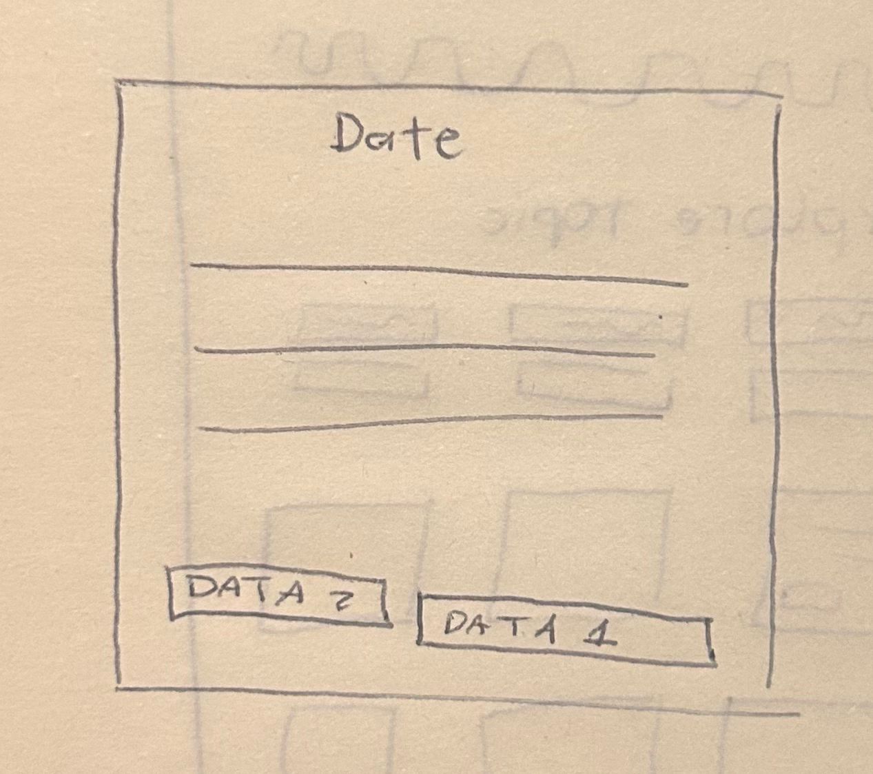
The Policy Basics cards had two problems. First, the typography hierarchy wasn't helping users scan: heading levels weren't visually distinct, and the relationship between title, description, and metadata read as flat. Second, the sector tags, labels indicating which issue area an article belongs to, weren't communicating what they were. Users couldn't tell if they were categories, filters, or decoration.
The fix was structural. I reorganized the type scale within the existing brand to create real hierarchy: primary text at one weight, secondary at another, metadata clearly separated. The sector tags got a treatment that reads as tags, consistent shape, positioned unambiguously as labels. No new fonts, no new colors. Just clearer decisions about what goes where and what it means.

The Navigation Redesign
The Research & Policy dropdown previously showed six issue areas at the same level, with no hierarchy and no starting point. Someone visiting TCI for the first time had no way to orient themselves, just a flat list with no obvious entry point.
The redesign introduced a "Get Started" entry at the top that leads to Policy Basics, followed by the six issue areas grouped under a clear label. The change makes the navigation accessible in the literal sense, it gives users who don't know where to begin a place to begin. It's a structural change, not a visual one. Small in the menu, significant for a first-time visitor.
The Filter System
Policy Basics organizes TCI's articles by issue area, but many articles touch more than one topic. The filter system was designed to reflect that: users can select multiple issue areas at once, and the content updates to show everything that matches.
This matters because TCI's work is inherently intersectional, a piece on education funding might also be about racial equity, or about state budget policy. A single-select filter would have forced artificial categories onto research that doesn't live in neat boxes. Multi-select lets the content be what it actually is.
03 — The Process
The Process
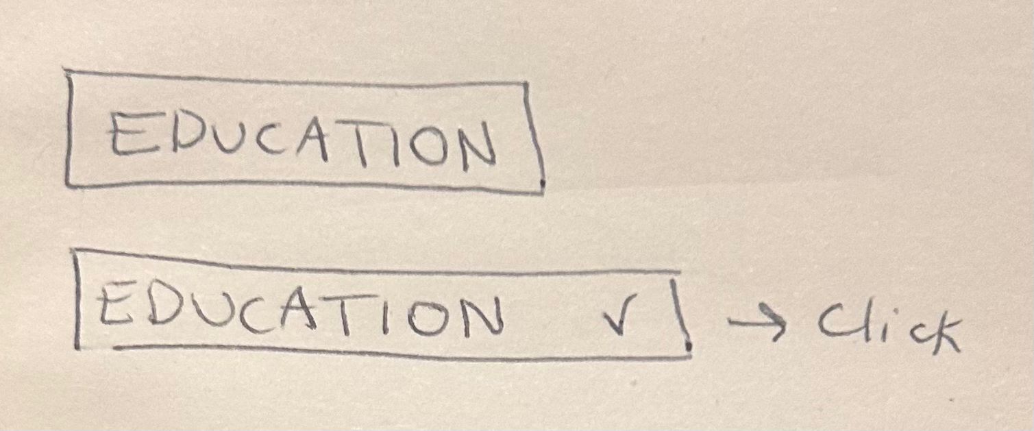
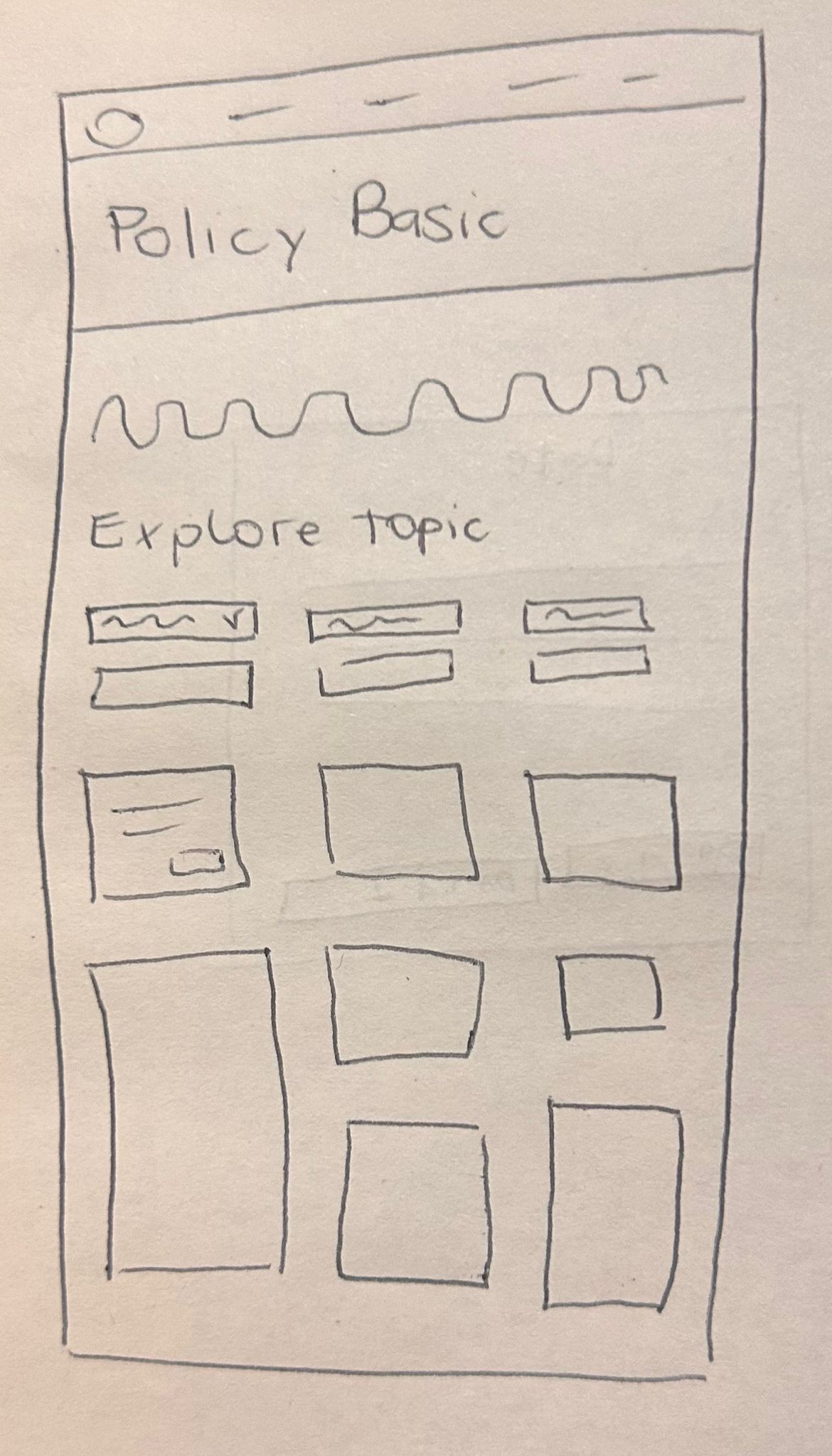
This project started with an accessibility audit. Together with my collaborator, a frontend developer with deep expertise in web accessibility, we analyzed the existing TCI site and identified the specific issues: the card type hierarchy wasn't helping users scan, the sector tags weren't communicating their purpose, and the navigation had no clear entry point for someone new to the site.
For the Policy Basics page, built from scratch, we started on paper. Sketches helped us explore the possible layout before committing to anything, and a site map defined how the information should be structured, including how the section would live within the site's header navigation. From there we moved into Figma for wireframes, then into UI design. We presented to the client, collected feedback, and made a final round of adjustments before delivery.
04 — The Result
The Result
Policy Basics is live. The components built for the section were adopted across the rest of the TCI site after launch, which is usually the clearest sign a design solved something real, not just the feature it was built for.
Let's connect