CPDP Champaign
Four Data Types. One Coherent System.
Mission
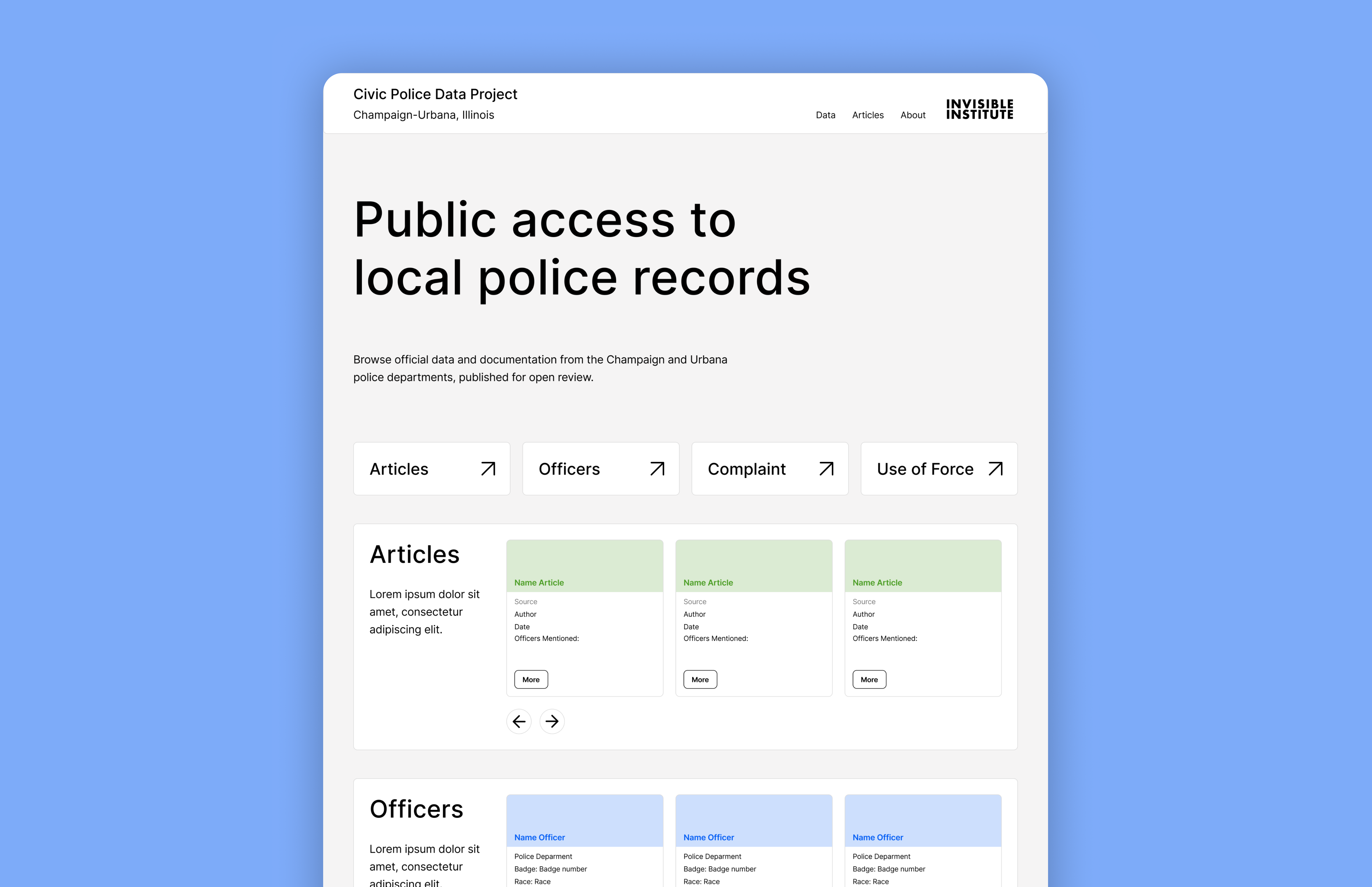
The Champaign Police Data Project makes official records from the Champaign and Urbana police departments publicly available for open review. This platform goes deep: articles, officer profiles, complaints, and use-of-force incidents, all browsable, all interconnected, all published for anyone to examine.
My Contribution
I designed the entire platform from scratch through a co-creative process with the Invisible Institute team, defining the information architecture for four distinct data types, leading ideation sessions to find a visual language that unified them without flattening their differences, and building the interaction design for the relational navigation between officers, complaints, and incidents.
Delivered
01 — The Problem
Context
Police accountability data is only useful if people can actually navigate it. The Champaign Police Data Project publishes four types of official records, articles, officer profiles, complaints, and use-of-force incidents, each rich with detail, each connected to the others. The challenge wasn’t collecting the data. It was designing a system where a resident, journalist, or legal professional could move through all of it without getting lost.
The Challenge
Each of the four data types needed its own dedicated page, officers live differently from complaints, and complaints live differently from use-of-force incidents. But they couldn’t feel like four separate tools. A user looking up an officer should naturally find their disciplinary history. From there, they should be able to open a specific incident and see every other officer involved. The information needed to flow.
The risk was building something that felt fragmented, or worse, overwhelming. Four categories, multiple pages, relational connections, too many moving parts can collapse into confusion fast.
02 — The Users
Understanding the Users
The platform serves residents, journalists, and legal professionals, but their needs here go deeper than a simple search. They’re building cases, investigating patterns, cross-referencing incidents. The design needed to support that kind of sustained, detailed exploration without creating friction at every step.
03 — The System
The Color System
The solution to keeping four data types unified without merging them into noise was color. Each category got its own consistent color, green for articles, blue for officers, orange for complaints, red for use of force, applied throughout every page, every card, every tag.

Color became the information architecture. A user scanning a page knows immediately what type of data they’re looking at. When they follow a link from an officer profile into a complaint, the color shift signals the transition. It’s a system that works visually before the user has read a single word.
Connecting the Data
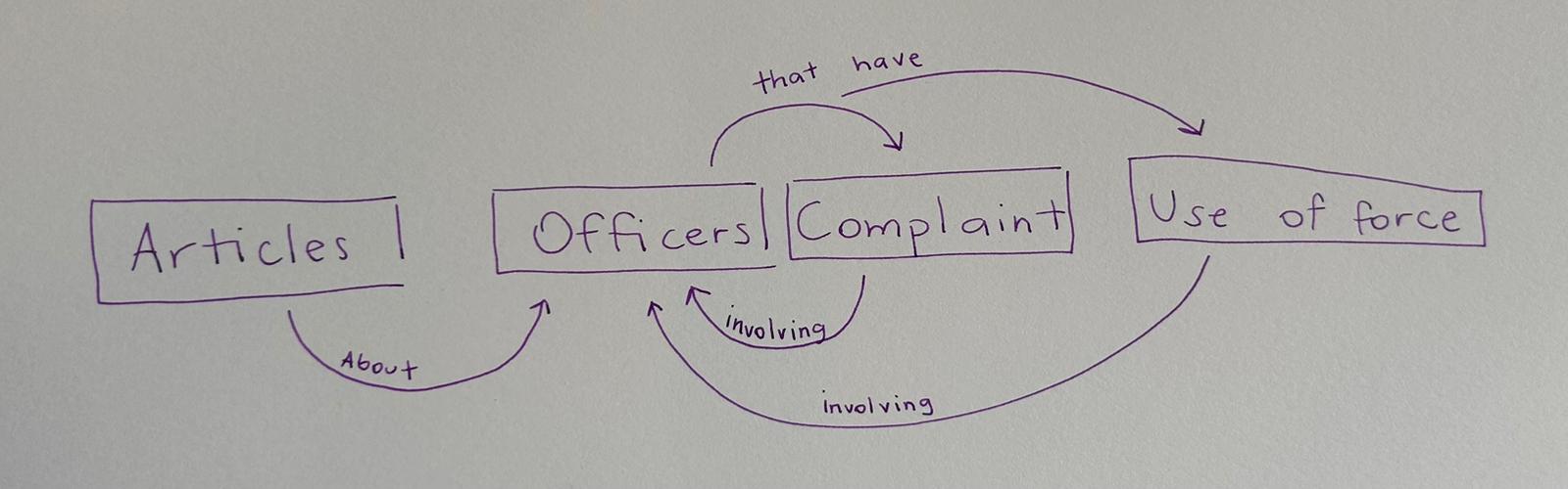
Before designing any screen, we mapped what information needed to connect to what, and why. That exercise revealed one thing: every data type leads back to an officer.
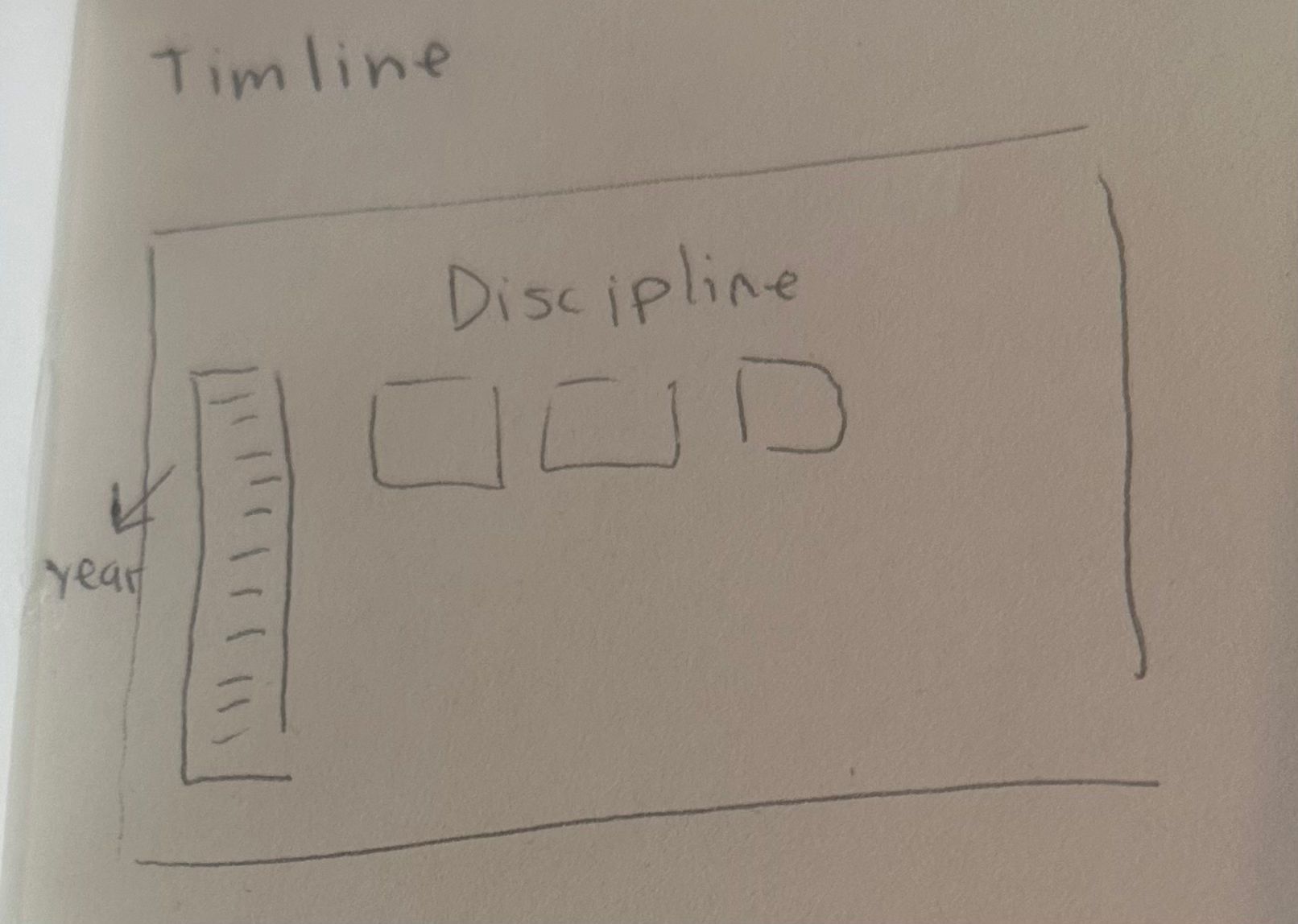
From there, the navigation designed itself. Each officer profile shows a full disciplinary timeline. From the timeline, a user can open any incident and see every other officer connected to that same case. What could have been a dead end becomes a thread to pull.
04 — The Process
From Paper to Figma
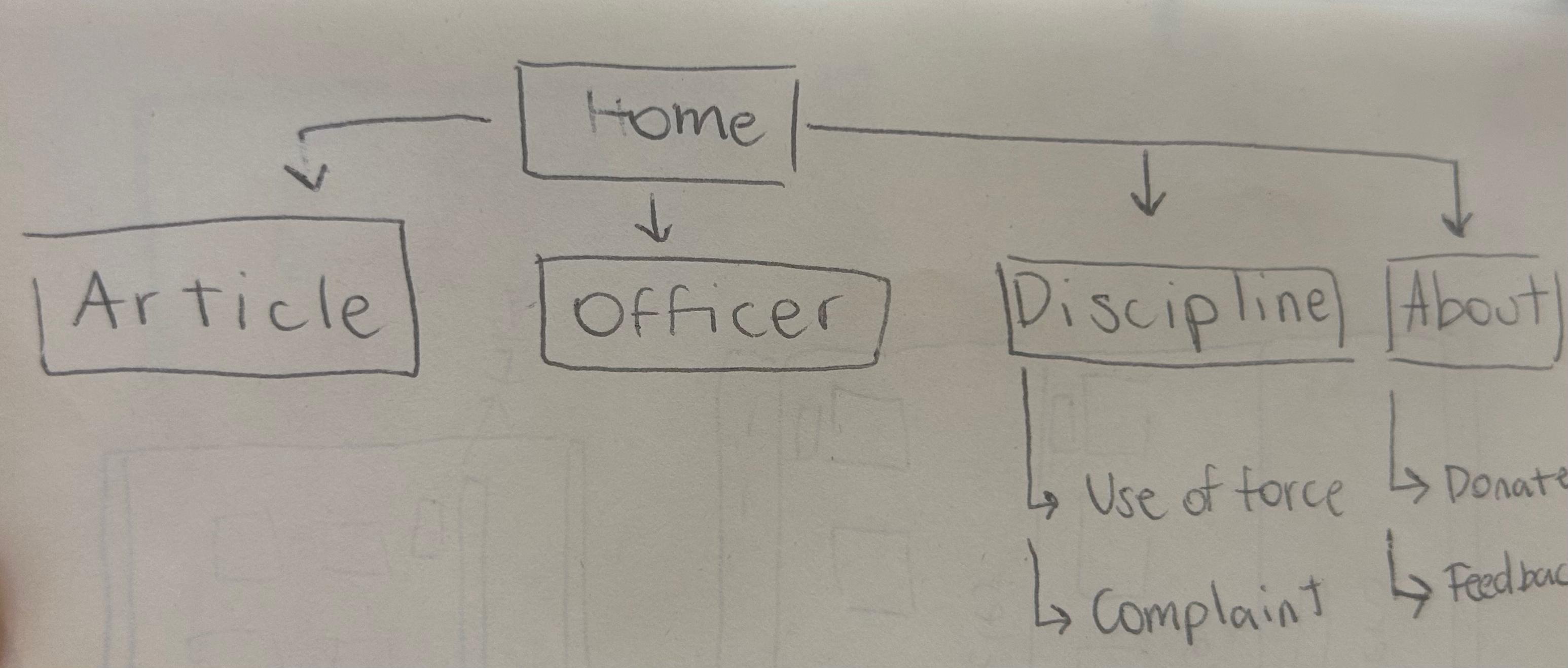
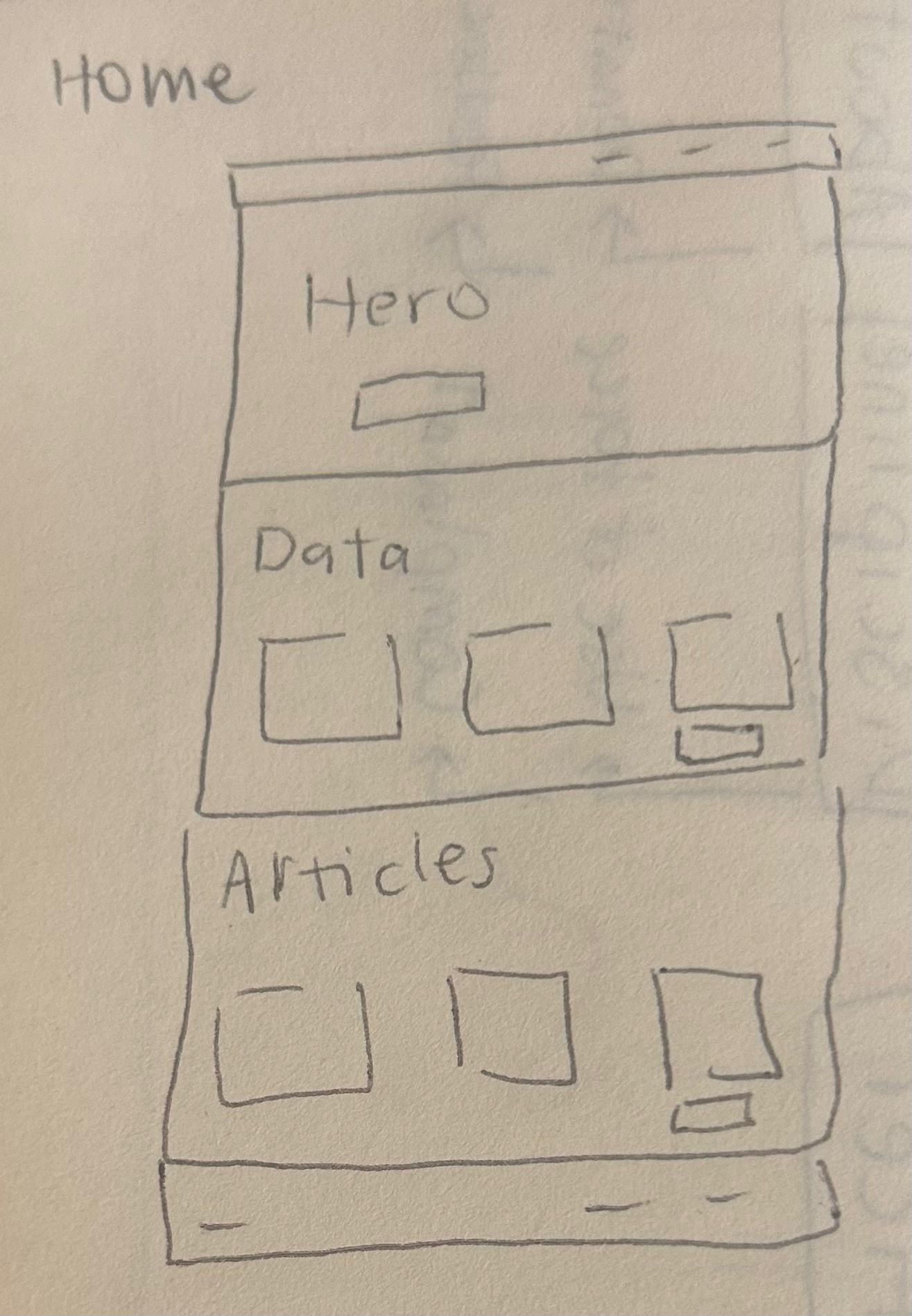
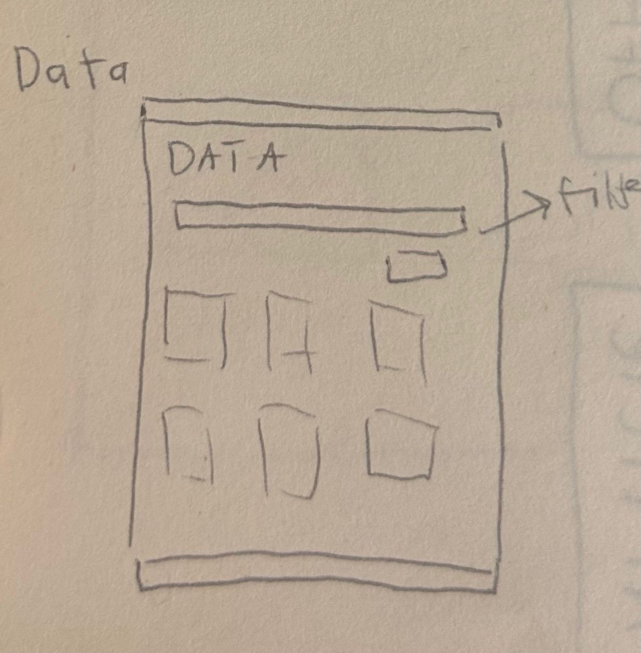
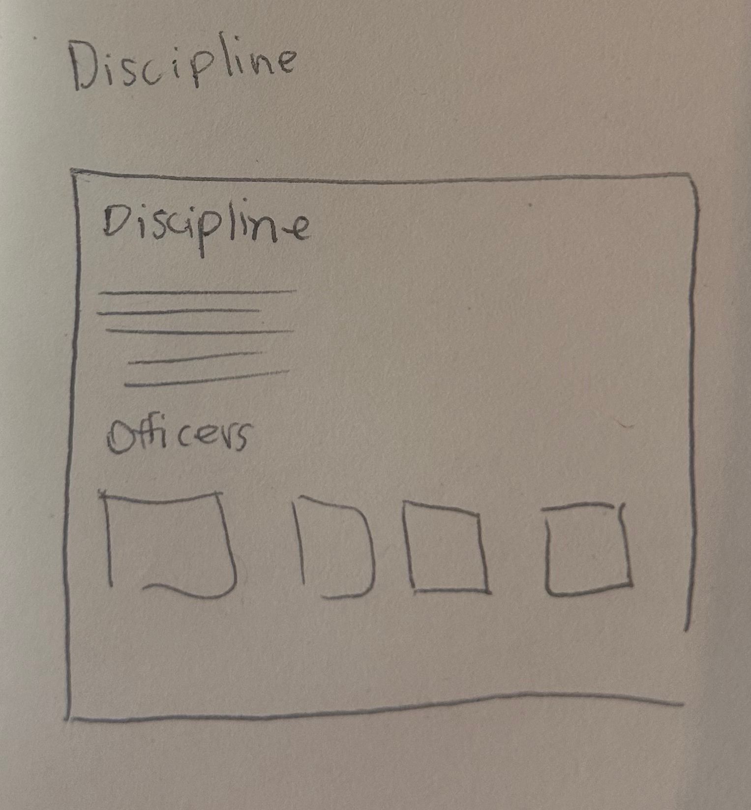
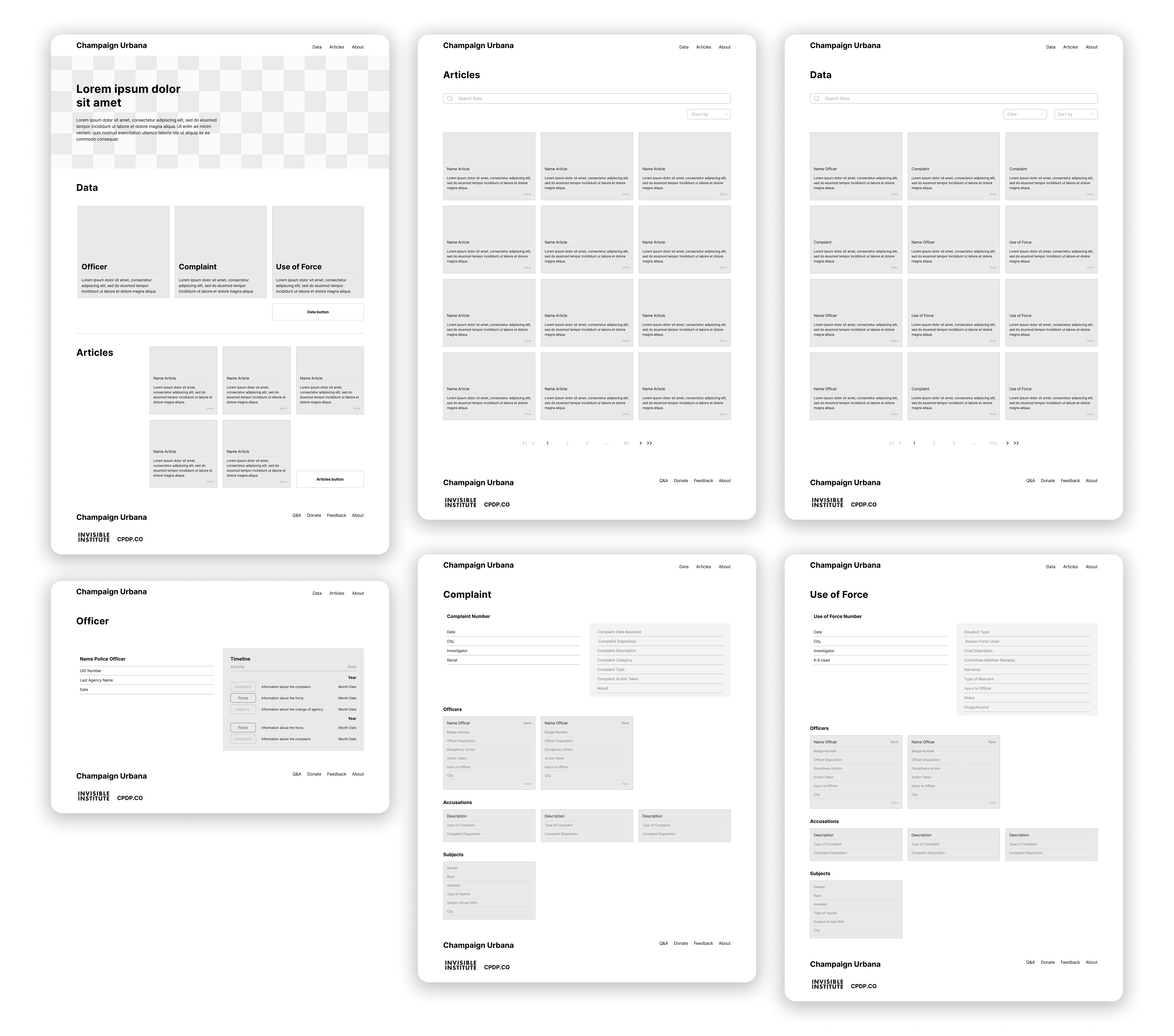
Every design decision started on paper. Sketching by hand let us map the hierarchy and flow quickly, without committing to any visual direction too early. Once the structure felt right, we moved into Figma for prototyping, structured feedback rounds, wireframe revisions, and finally the UI. Some feedback pushed us back to the architecture level, particularly around how the relational connections between data types should work. Getting that right before moving to UI saved significant rework.
Iterations
The design didn’t arrive fully formed. Each round of feedback from the Invisible Institute sharpened what the platform needed to be, and what it didn’t.
First Iteration
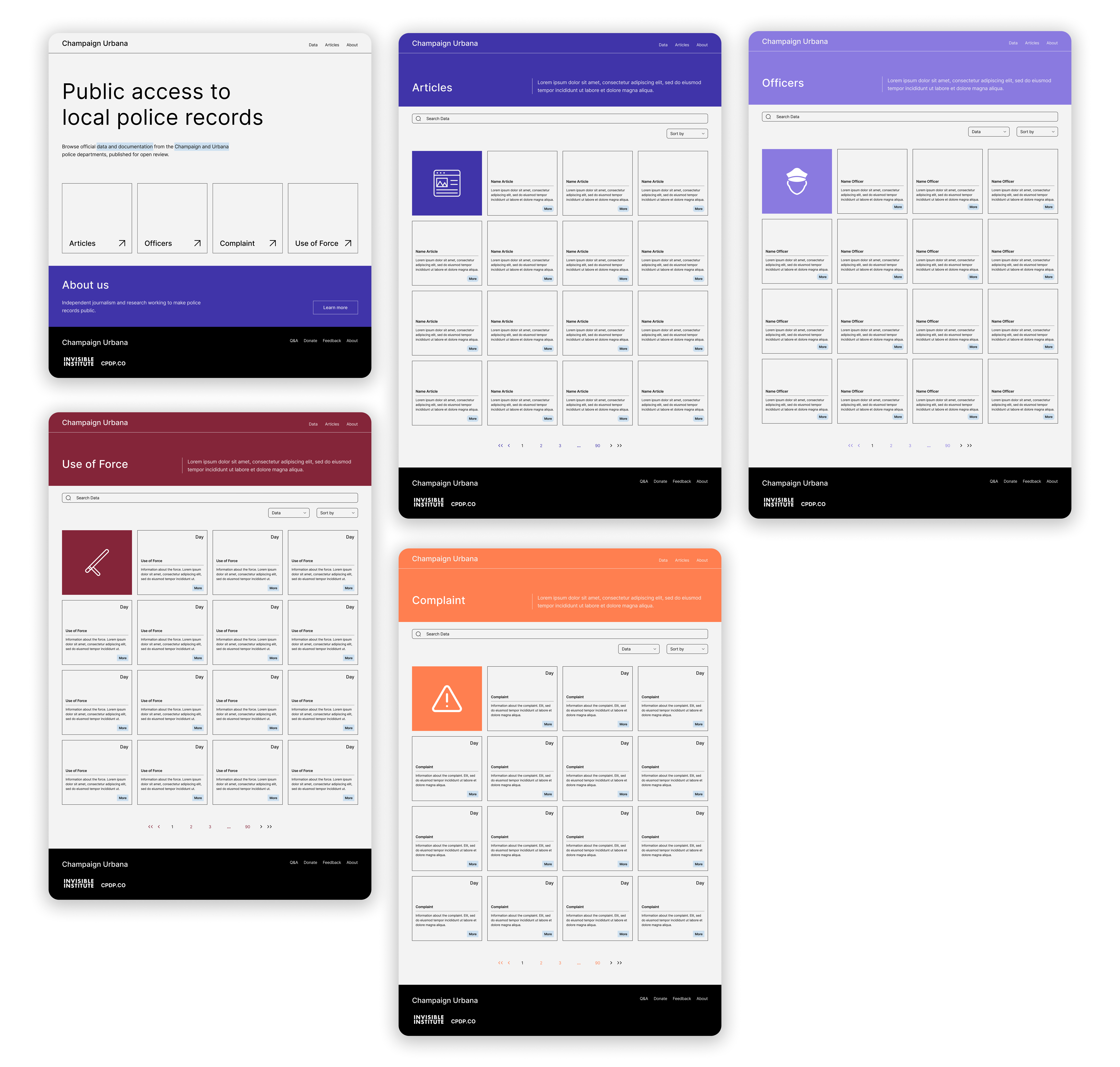
The first version established the structure: one dedicated page per data type, a consistent layout, and a color per category. The colors were strong and saturated, each section with its own bold identity. It worked as a proof of concept, but it felt too heavy for a public accountability tool. The visual weight competed with the content instead of serving it.
Second Iteration
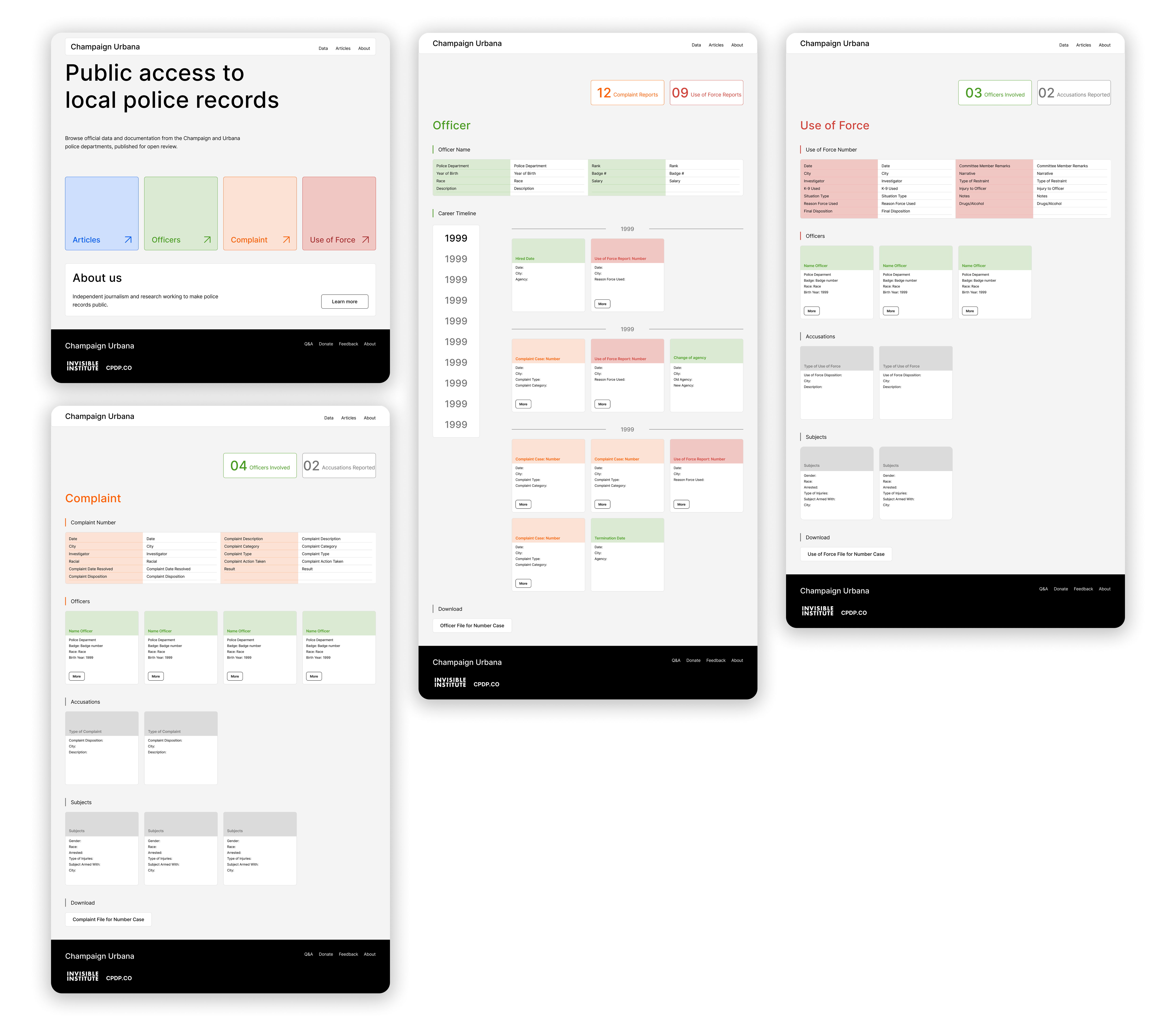
The second version brought the design closer to Invisible Institute’s visual language. Softer colors, rounded corners, a lighter feel overall. The four data types kept their individual identity but no longer felt like four separate products.
Testing this version with the client revealed two friction points: the homepage wasn’t making the platform’s purpose clear at a glance, and the timeline format made it harder, not easier, to read the data in sequence. Both needed to change before the design could move forward.
05 — The Result
The Result
After multiple iterations, prototyping rounds, and direct feedback from the Invisible Institute team, the design landed where it needed to be: a system where four data types feel like one coherent platform.
The designs for CPDP Champaign are complete and approved. The platform is currently in development. When it launches, it will be the most detailed public view of police records available for Champaign and Urbana, a system where the data actually speaks for itself.

Let's connect